building

Shop Slow was created as a response to a gap in our local community: a need for a dedicated space where sustainability, creativity, and collective care could thrive.
More than a boutique, it served as a hub for education, collaboration, and the celebration of slow fashion. From the start, our goal was to foster deeper emotional connection between people and their clothing, while creating a platform that elevated local designers and regenerative practices. Our brand needed to reflect that ethos — inviting, inclusive, and rooted in narrative-driven design.


At every touchpoint — from murals to packaging to digital campaigns — we prioritized a design language that translated our values into accessible, visually engaging moments.
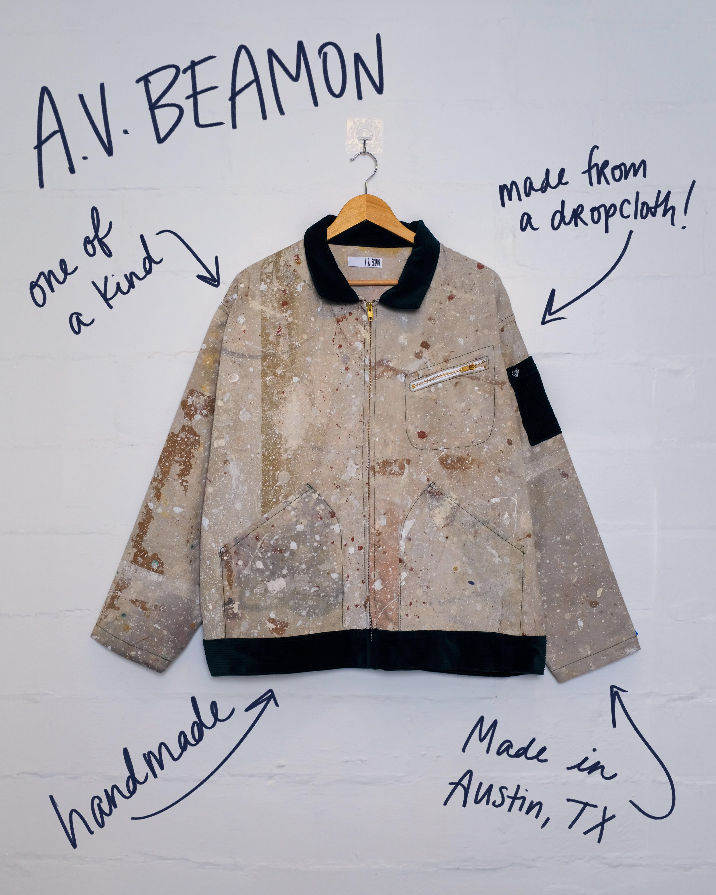
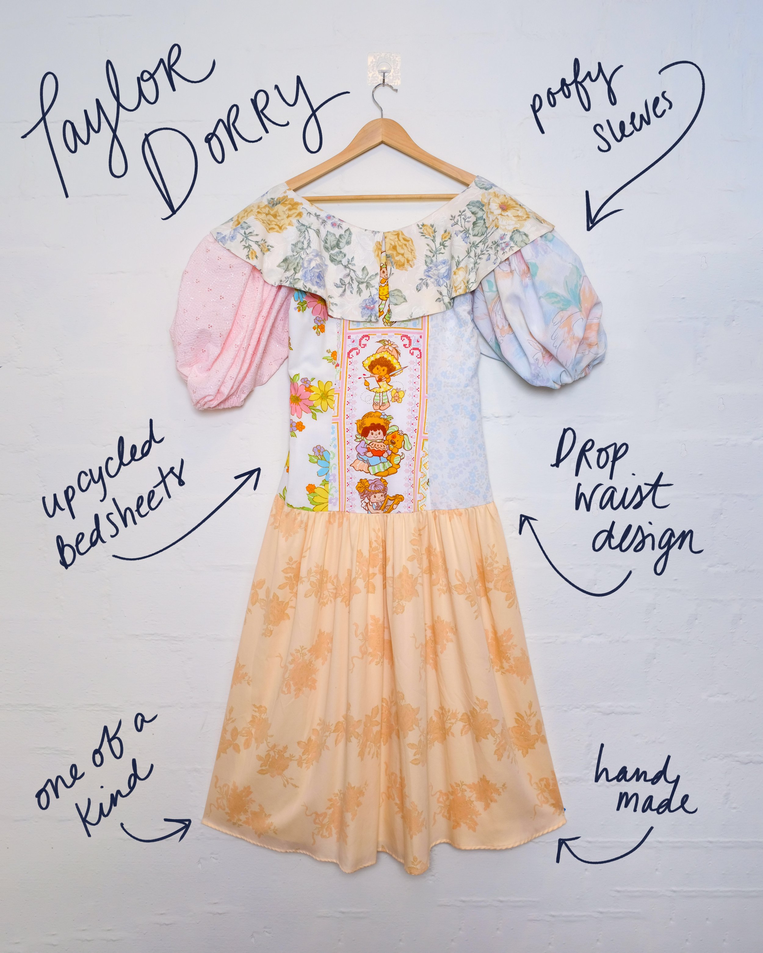
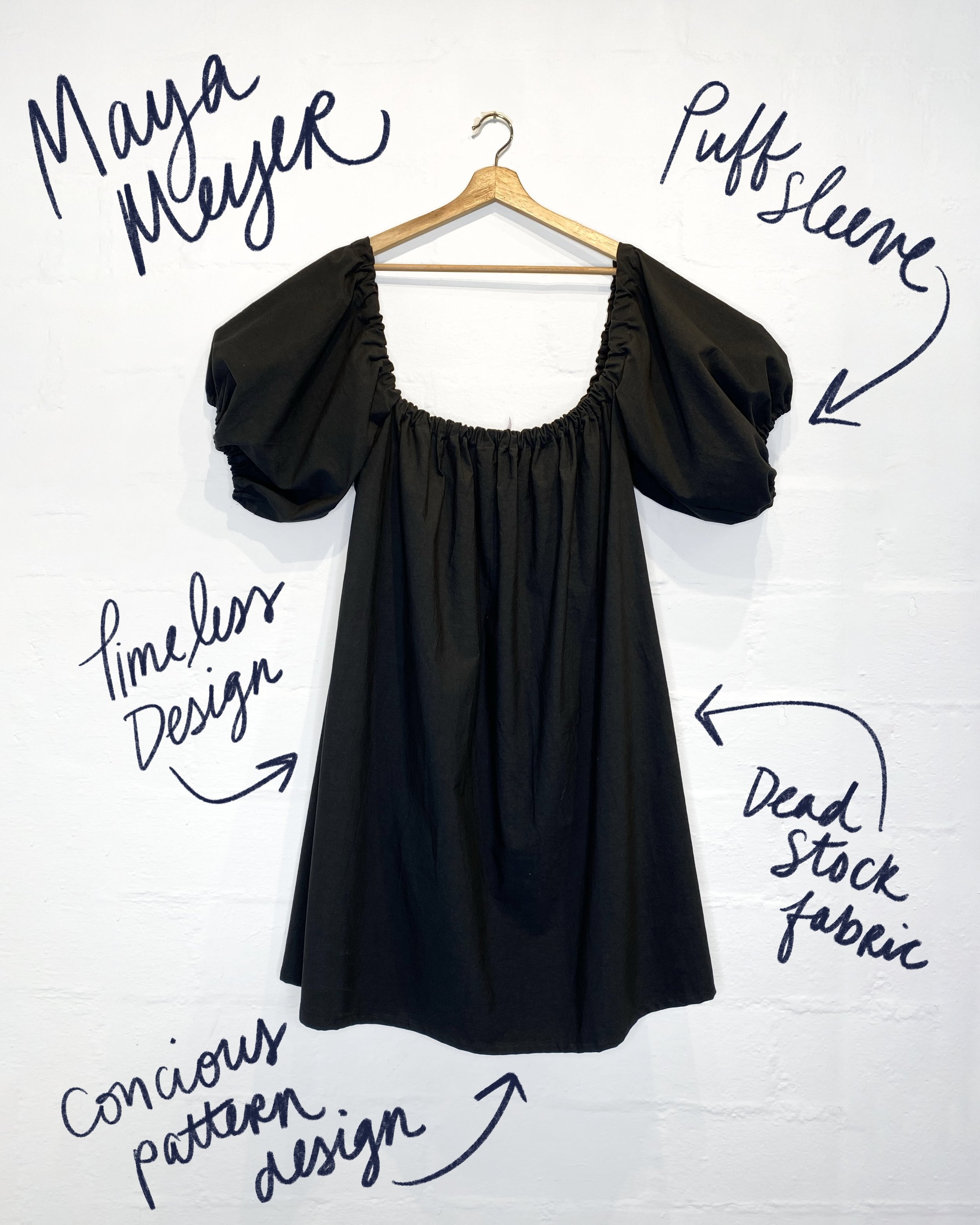
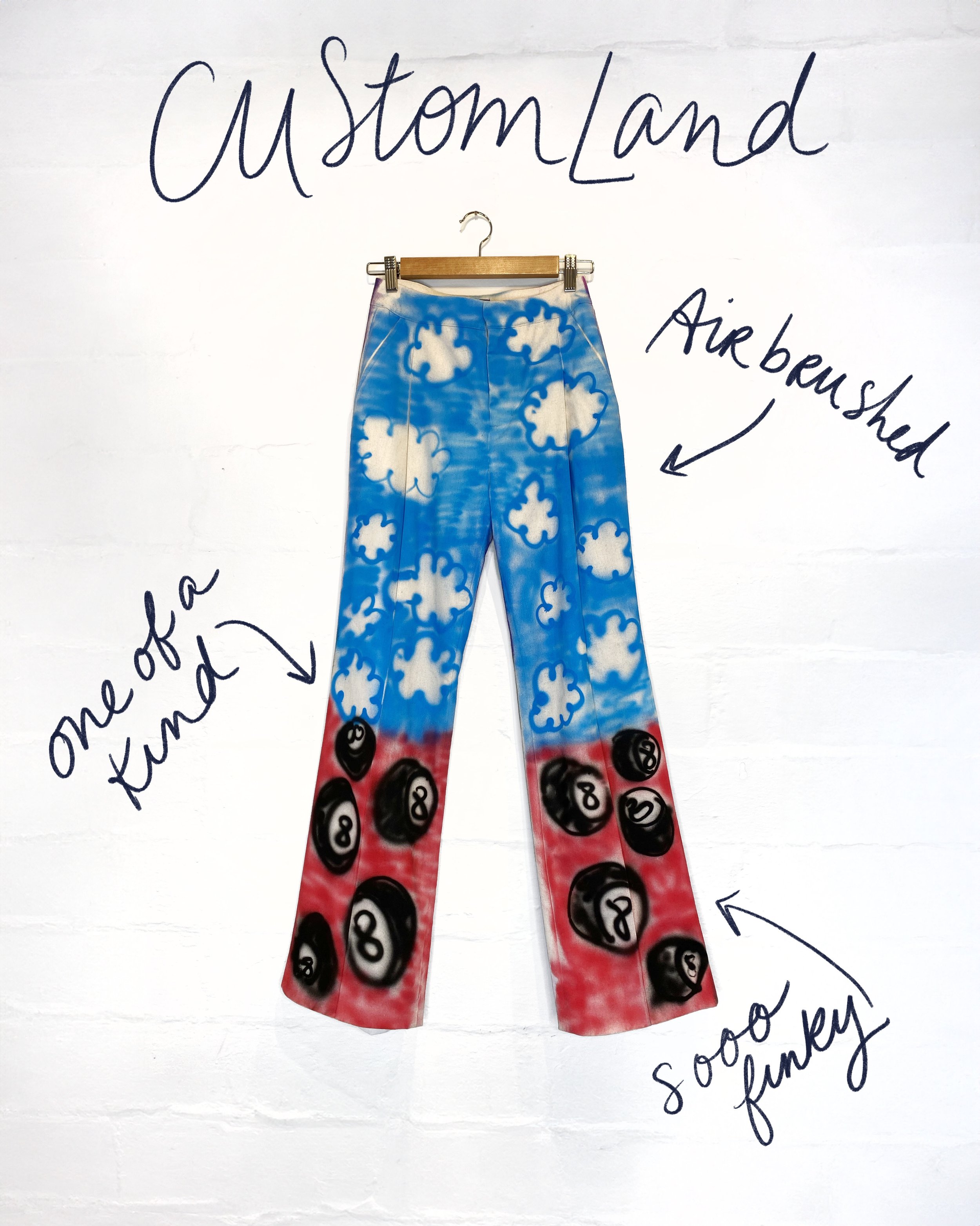
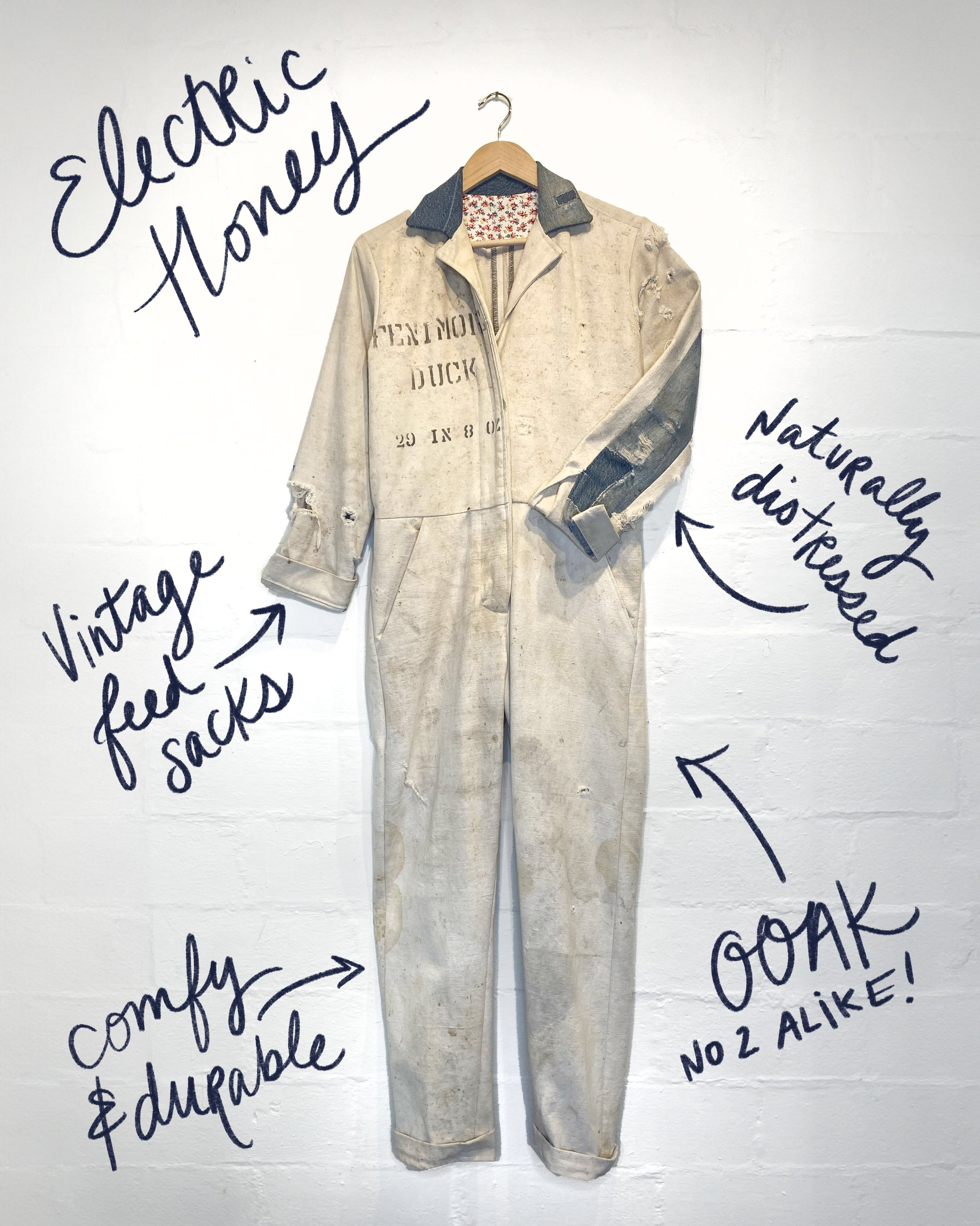
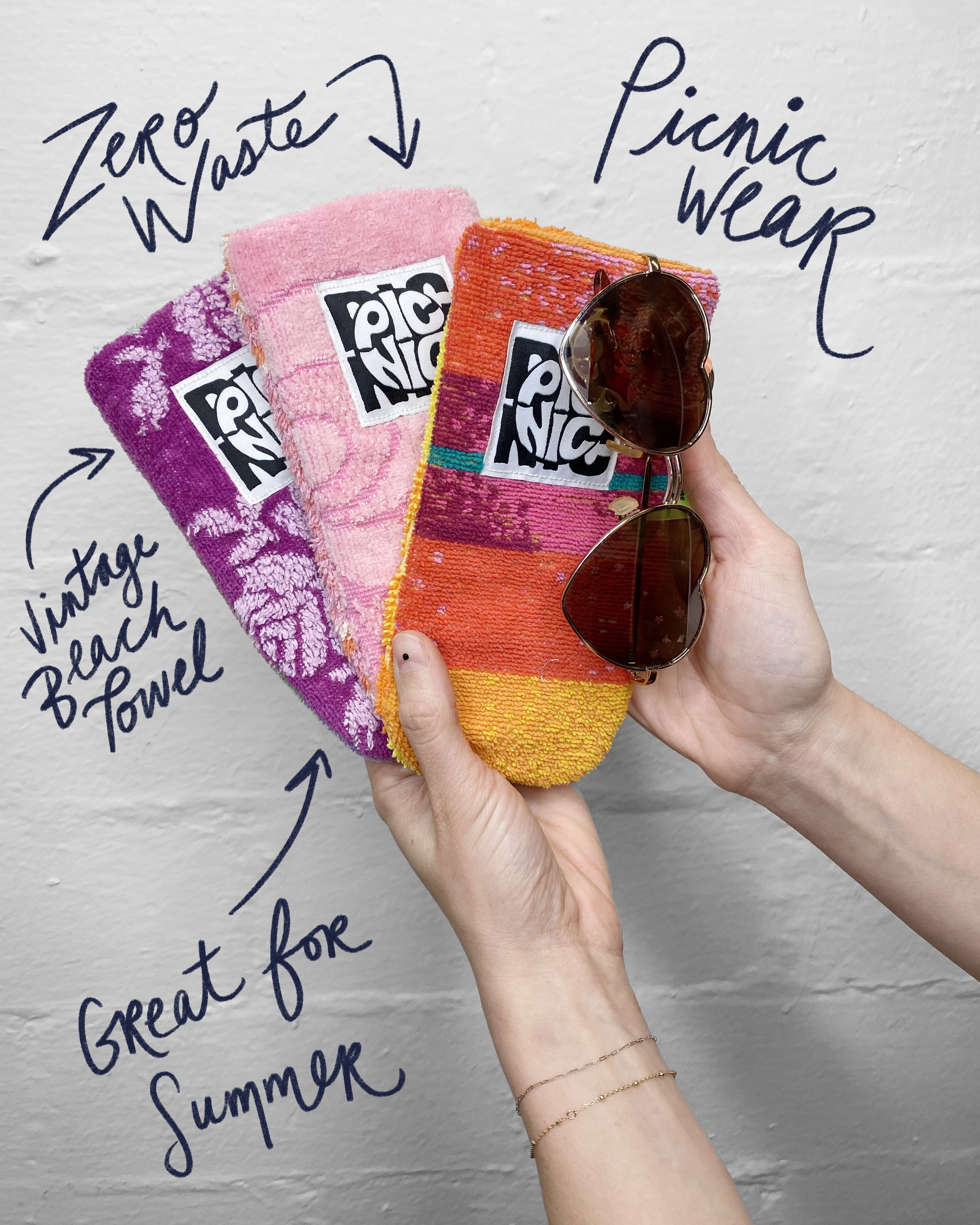
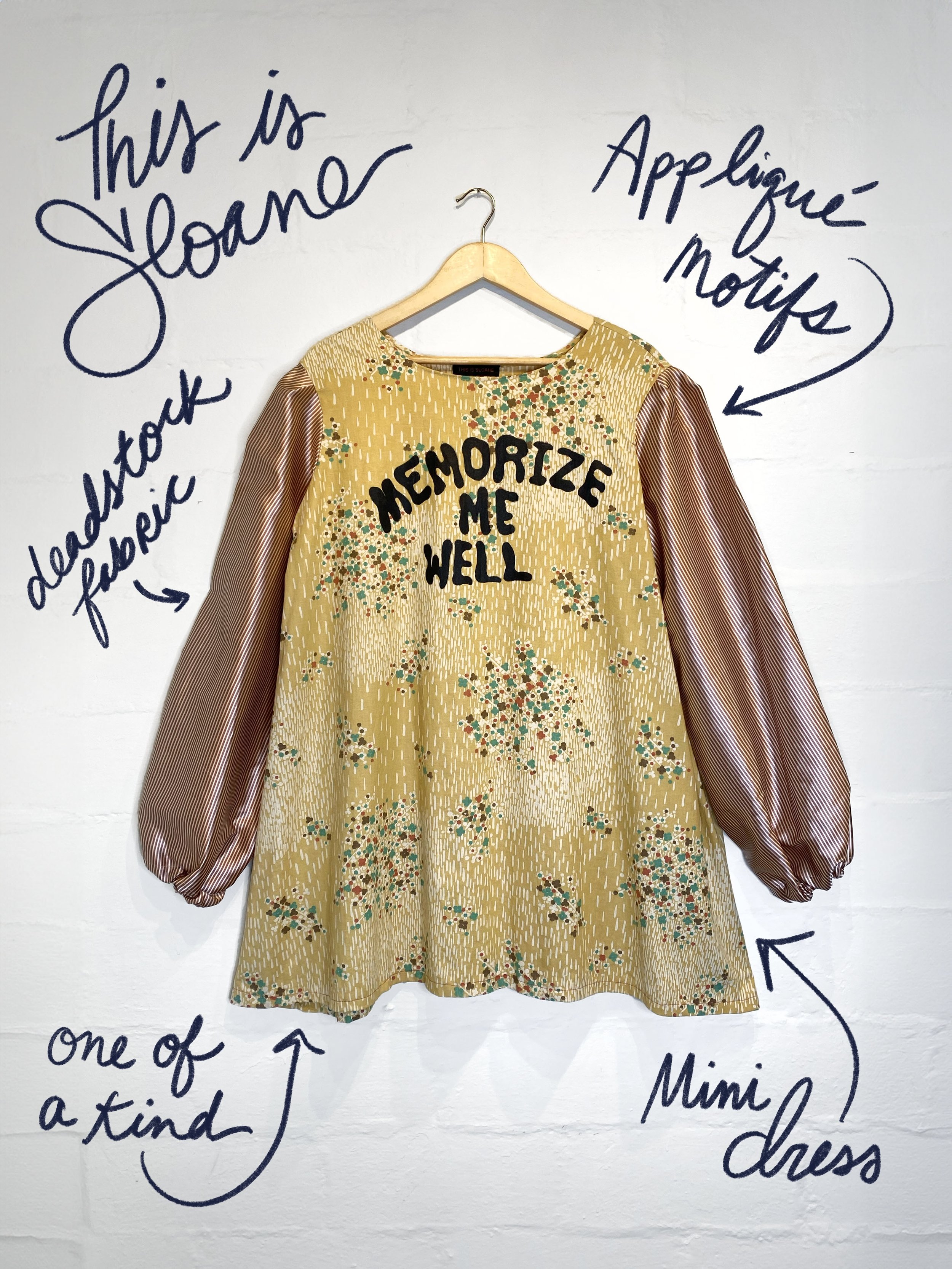
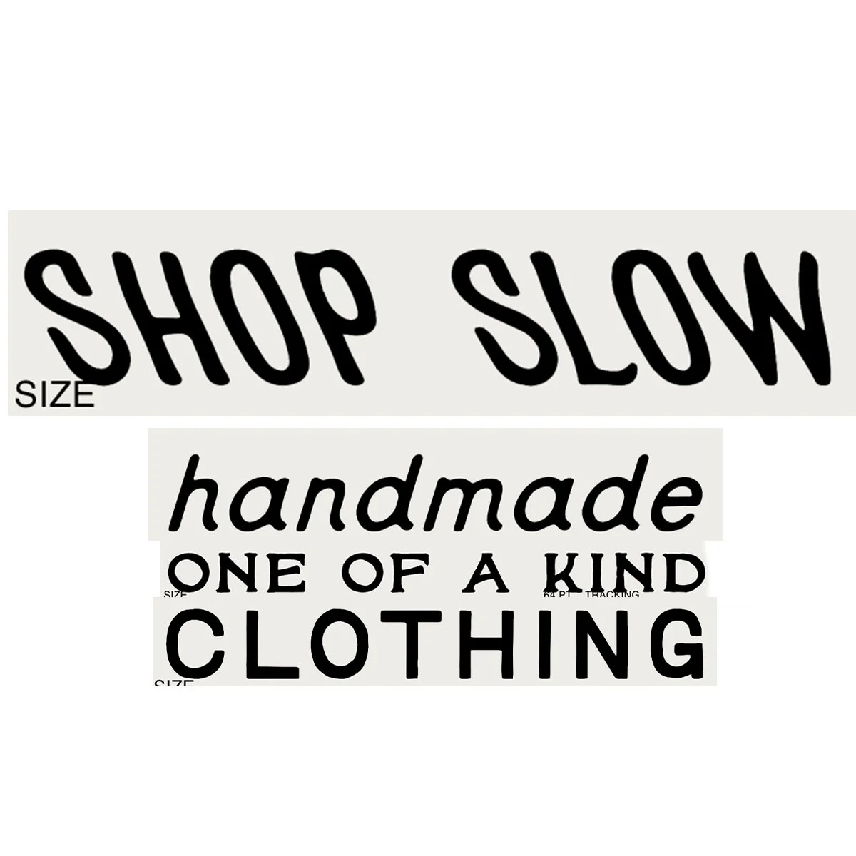
What: A community-led sustainable fashion space using reclaimed materials and one-of-a-kind products
Why: To make sustainable design feel fun, inclusive, and emotionally resonant, not sterile or minimalist
How: Through a limited yet expressive palette, intuitive material cues, and graphic systems that reflect care, individuality, and reuse
We approached every decision with a focus on material storytelling and consumer insight, recognizing that the textures, colors, and visual rhythm of our brand could shape how people connected with our space and its mission.
The result was a cohesive visual identity that felt modern, approachable, and instantly recognizable. Our color strategy reinforced the idea that sustainability can be joyful and expressive, while our brand tone balanced community intimacy with design credibility.
Everything we created carried a human touch, from printed zines and event posters to environmental graphics and hand-painted signage, inviting people to slow down, engage, and participate in a culture of collective creativity.

We looked to western Texas for inspiration: warm, dusty tones that evoked nostalgia without feeling dated. The goal was to develop a color story that was familiar yet unexpected — something that honored tradition while reflecting our contemporary point of view.
I also pulled visual references from hand-drawn punk posters from the early 70s, sign painting and 1950s magazine advertisements - drawn to their playful compositions, bold contrasts, and saturated hues. Their tactile, analog feel informed our approach to layout: layered, slightly imperfect, and always hand-touched.
This mix of intentional chaos and graphic clarity became a signature visual style for our brand.

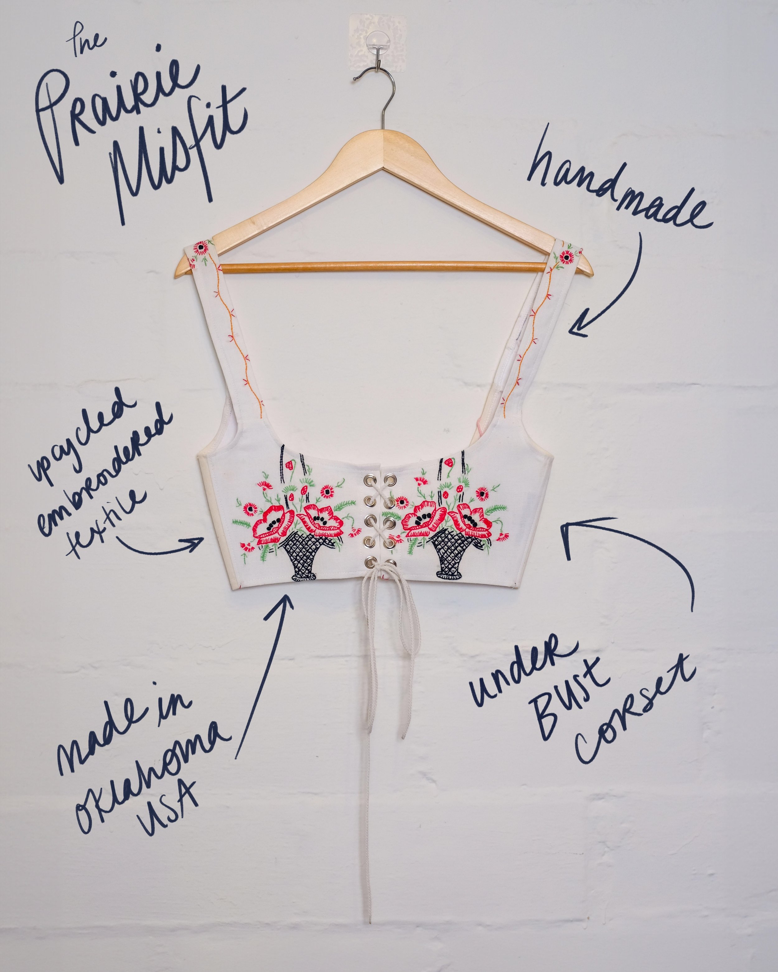
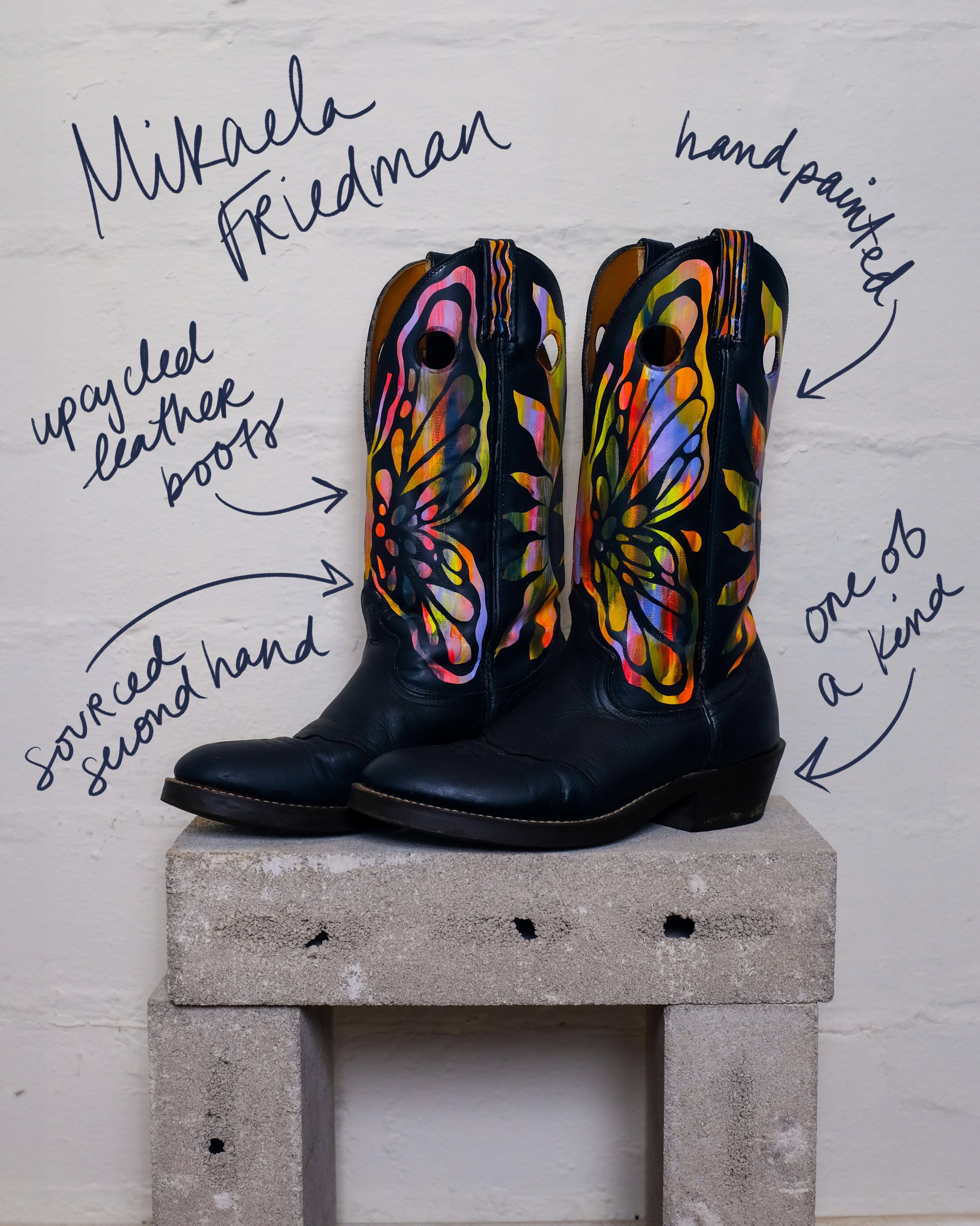
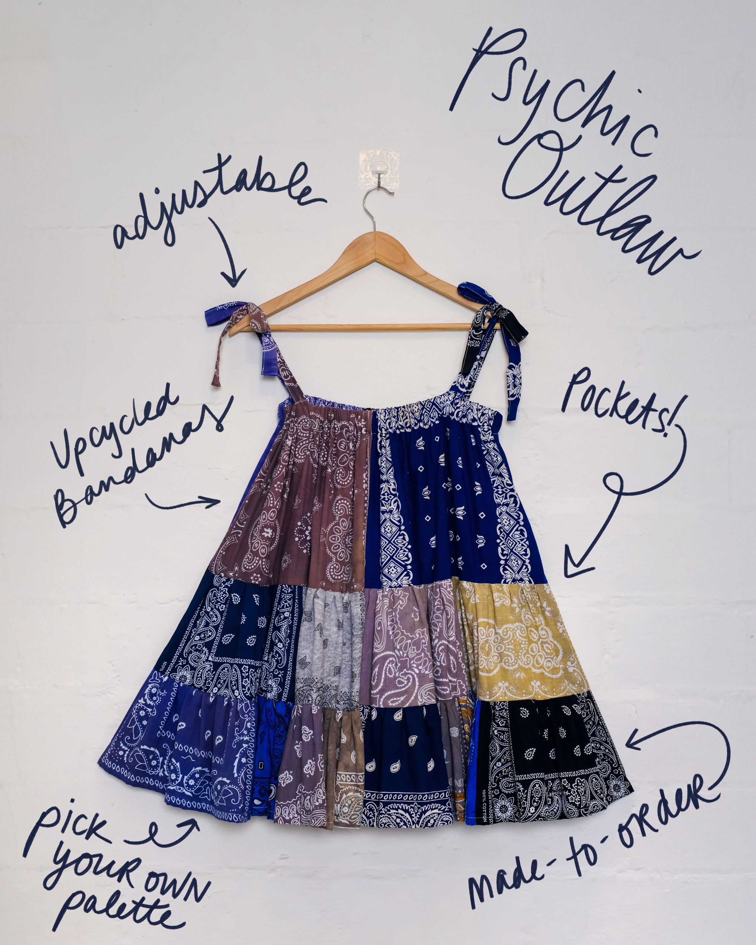
Crafting an identity grounded in purpose was our number one goal. Finding inspiration in the textile we were upcycling was a turning point for bringing Shop Slow to life.
Our color palette was directly informed by the materials we worked with: secondhand textiles, vintage linens, and hand-dyed remnants. Working within those limitations became part of the creative challenge — selecting tones that would resonate emotionally while honoring the story behind each piece.


Of course, we had to paint the whole thing pink.


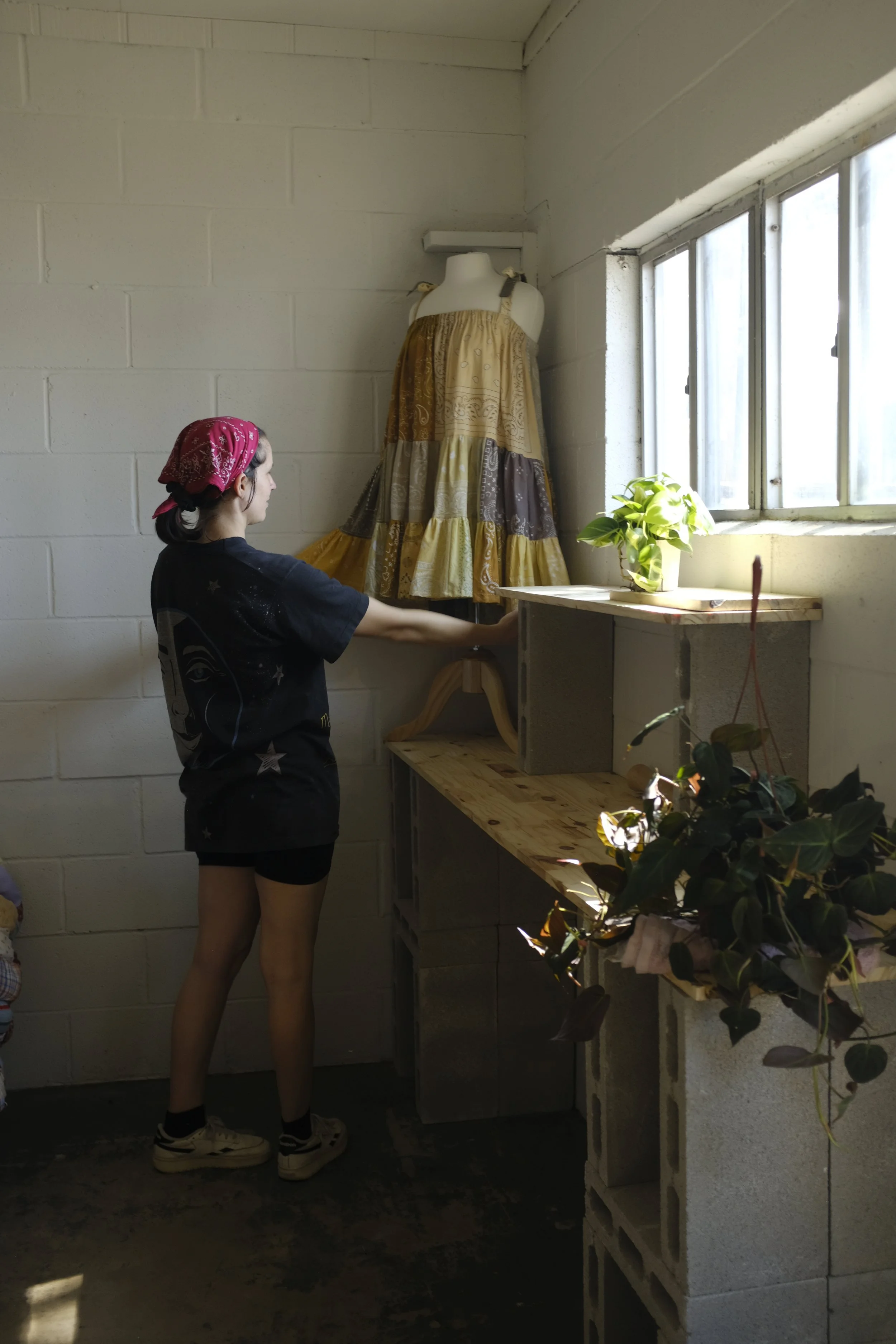
We designed the layout with consumer behavior in mind, grouping clothing by designer rather than by size to honor the individuality of each maker’s sizing system.
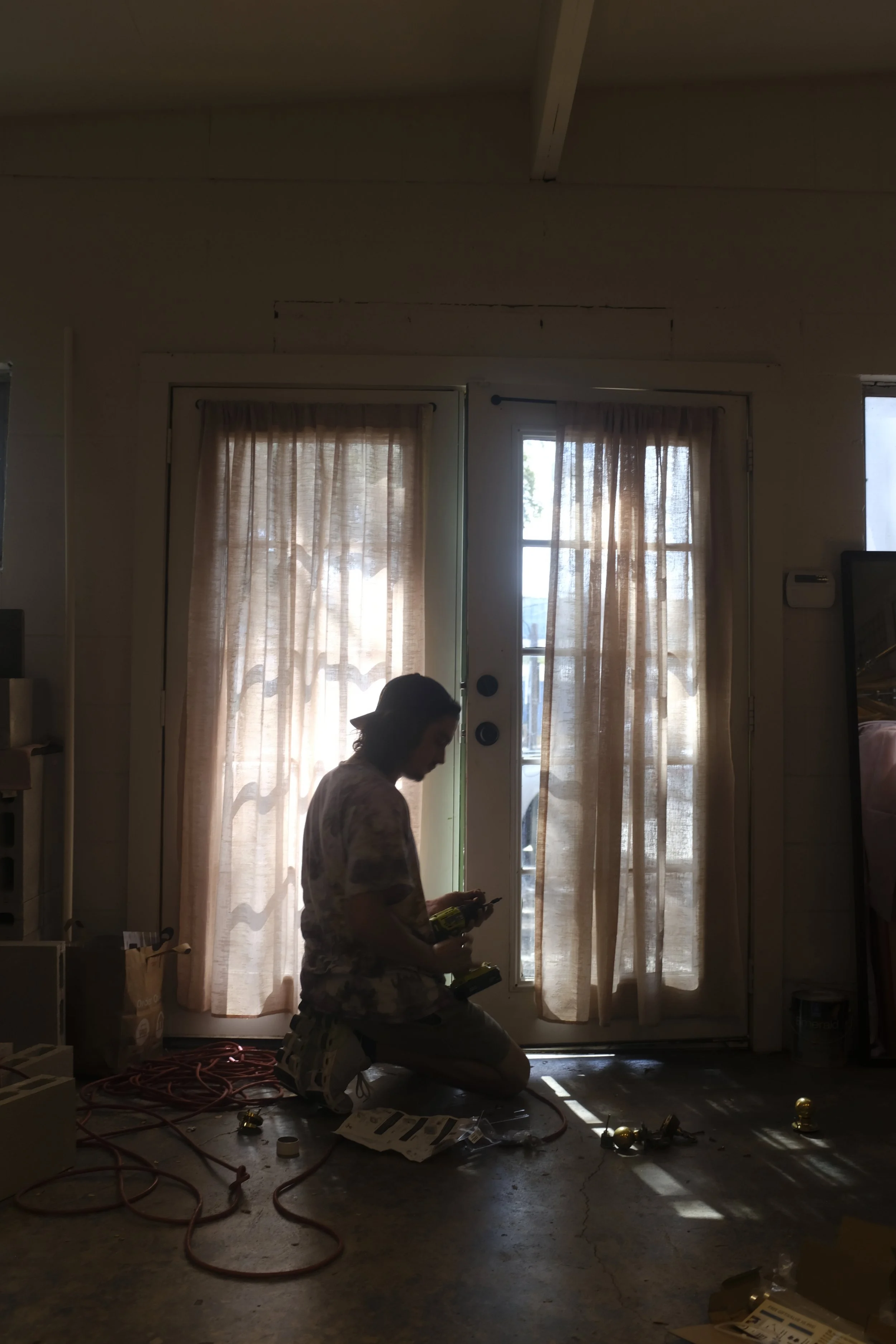
The studio side of Shop Slow was left open to invite transparency into the garment-making process. Customers could browse, choose textiles, and discuss commissions in the same space where garments were made.

T-Shirt Design: SFF x Raw Paw at SXSW (2024)
For Slow Fashion Festival’s unofficial SXSW meetup, I designed a screen print graphic in collaboration with local print shop Raw Paw. We hosted an on-site printing station where attendees could bring their own garments to be printed for free promoting reuse, customization, and sustainable design.
The graphics are inspired by protest posters and zine culture, designed to print well across varied textiles and colors.


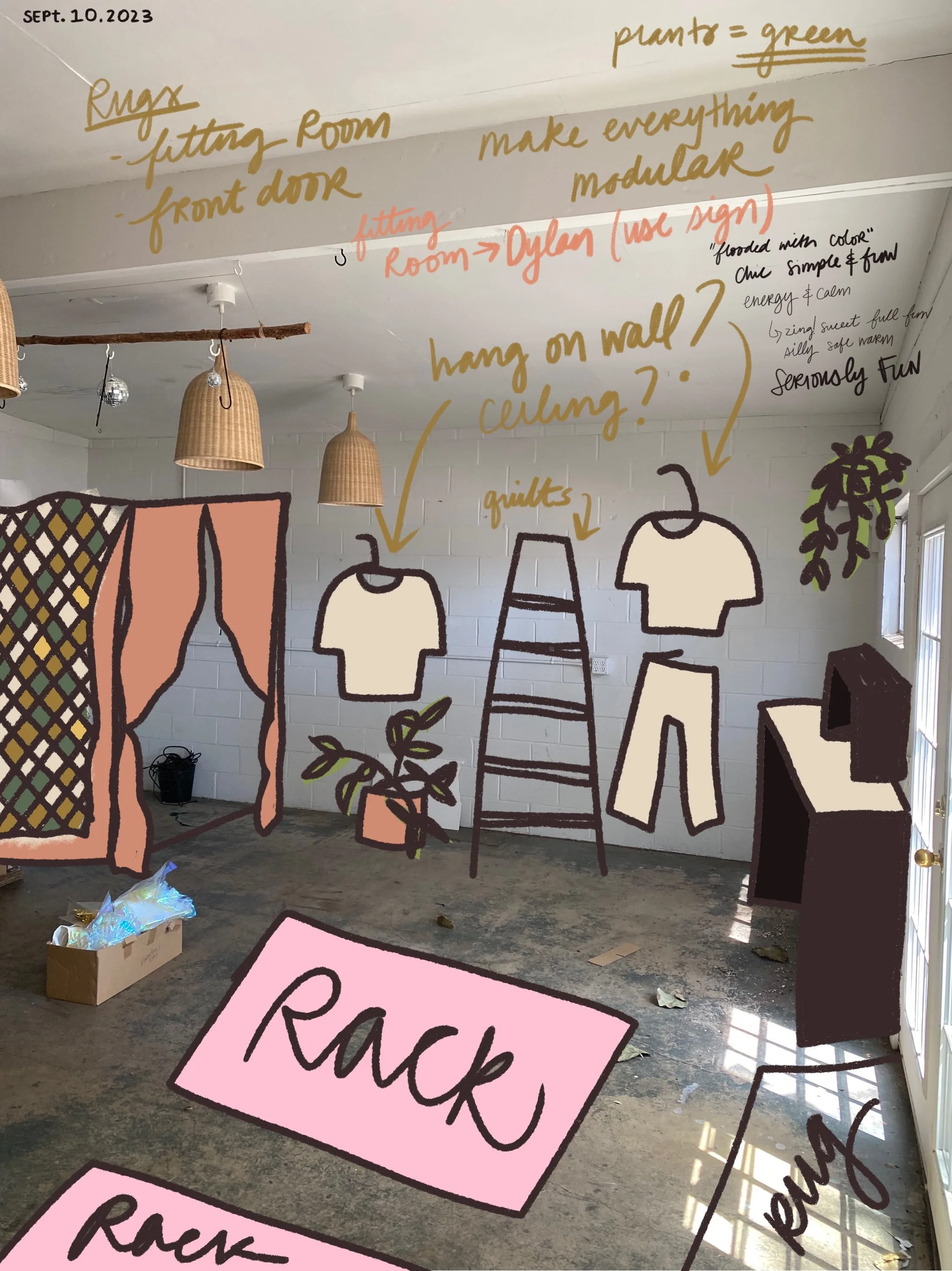
Sustainability guided every material decision. We repurposed wood from the previous owner's signage, used reclaimed cement pavers for modular displays, and incorporated found objects like a vintage ladder to display hand-quilted textiles. These elements gave the space an intentional, lived-in feeling.
Everything in the store was designed to be modular and adaptive, allowing us to shift layouts for events, workshops, and seasonal changes. Post–soft opening feedback confirmed our approach; the only update needed was moving the cash wrap to improve flow, the rest, from color palette to functionality, worked exactly as intended.


Drawing inspiration from the early shopping mall designs of the 1950s and 60s, particularly the Southdale Center by Victor Gruen, we wanted Shop Slow to function as a collaborative, welcoming alternative to sterile retail spaces.
The emotional tone was just as important as the physical one, we wanted the store to feel soft, bright, vintage-but-alive, and body-positive, with plenty of room to browse, get measured, or just exist in comfort.
Our color strategy balanced function and feeling: we kept walls white to foreground the garments themselves, while introducing our signature warm pink through soft accents and a color-drenched cash wrap, a gesture of warmth and a nod to the labor of women behind the textiles we use.


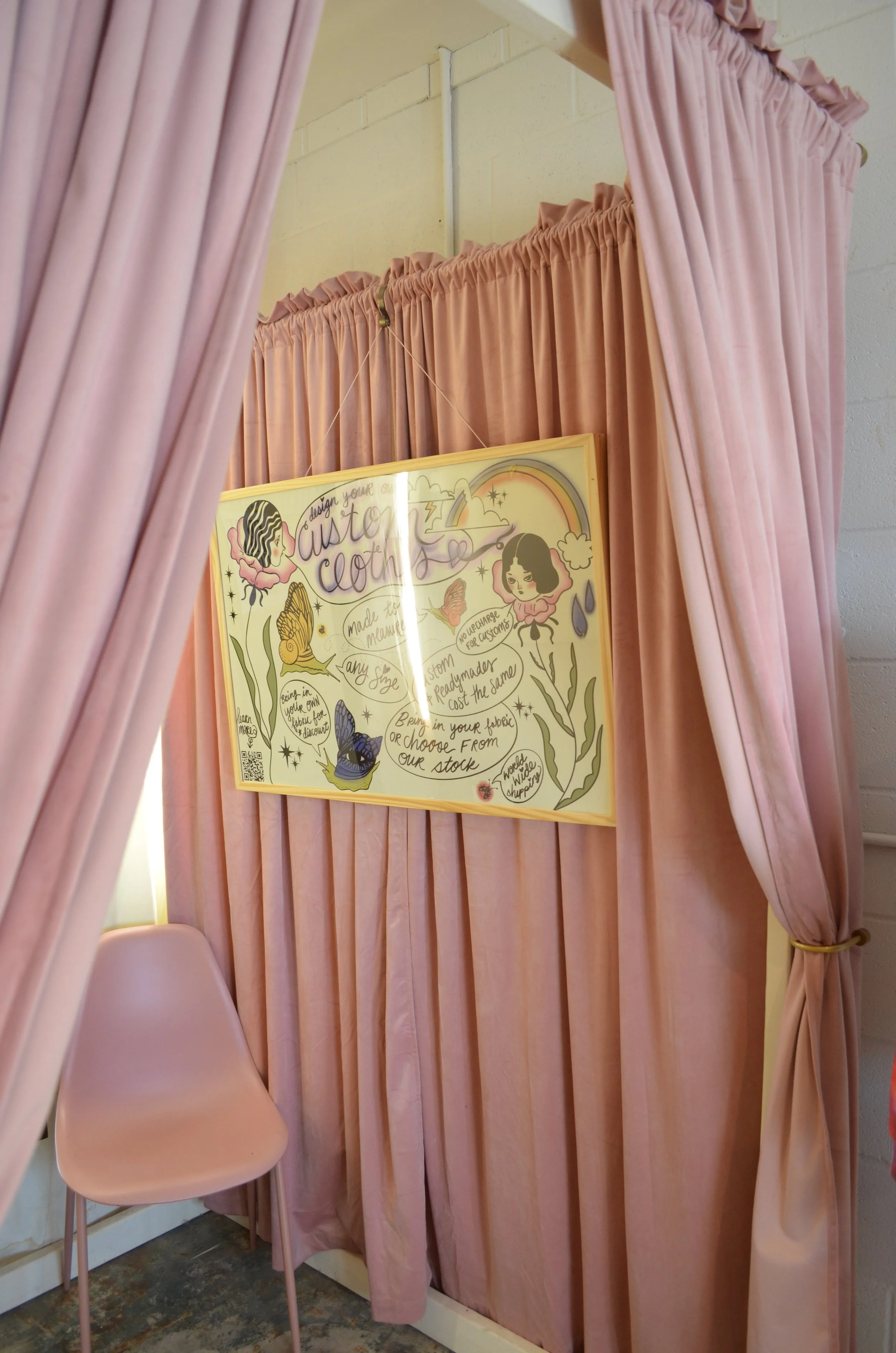
Custom Clothing Infographic: Shop Slow (2024)
In order to demystify slow fashion for our customers, I designed an educational infographic to explain the custom clothing process at Shop Slow, breaking down how customers could choose textiles, get measured, and co-create a garment with our team.
The design was optimized for both print and digital use, allowing us to display it in the dressing room while also sharing it across social media, newsletters, and event materials.